ggplot2の棒グラフの上や下に値をラベルとして書き込む方法のメモ
ggplot2の棒グラフの上や下に値をラベルとして書き込む方法のメモ。とりあえず簡単なgeom_col()の場合で書いていく。
上に書くだけならgeom_text()で位置を調整して書けばいい。
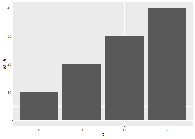
例えば次のようなデータの場合。
library(ggplot2)
df <- data.frame(X = LETTERS[1:4],
                 value = c(10, 20, 30, 40))
df
##   X value
## 1 A    10
## 2 B    20
## 3 C    30
## 4 D    40
ggplot(df, aes(x = X, y = value)) +
  geom_col()
この棒グラフの上に値を書き込みたいと思いたい場合、geom_text()を使い、そのままの位置に書くと棒グラフに被るので、棒グラフの上に描画するようにvjustやnudge_yを使ってラベルの位置を調整しながら次のようにかける。
ggplot(df, aes(x = X, y = value)) +
  geom_col() +
  geom_text(aes(label = value), nudge_y = 2)

ggplot(df, aes(x = X, y = value)) +
  geom_col() +
  geom_text(aes(label = value), vjust = -0.5) +
  ylim(0, 42)

nudge_yとvjustの違いは上のコードを見てもらえば分かる通り、nudge_yの場合はいい塩梅に描画範囲を調整してくれるが、vjustは描画範囲を調整してくれないので、自分で調整する必要がある。
じゃあ、いつもnudge_yでいいじゃないかとなるかもしれないが一部画面ではvjustのほうが都合がいい場合がある。
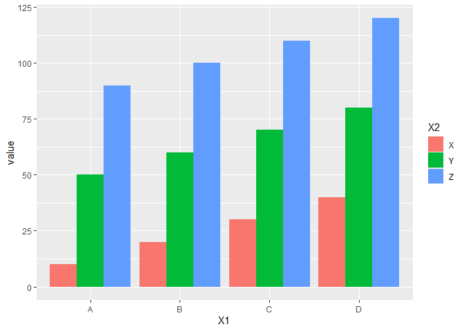
例えば次のようなデータで横棒グラフを描く場合を考える。
df <- data.frame(X1 = rep(LETTERS[1:4], 3),
                 X2 = rep(LETTERS[24:26], each = 4),
                 value = seq(10, by = 10, length.out = 12))
head(df)
##   X1 X2 value
## 1  A  X    10
## 2  B  X    20
## 3  C  X    30
## 4  D  X    40
## 5  A  Y    50
## 6  B  Y    60
ggplot(df, aes(x = X1, y = value, fill = X2)) +
  geom_col(position = position_dodge())
このとき、nudge_yだと次のようになる。
ggplot(df, aes(x = X1, y = value, fill = X2)) +
  geom_col(position = position_dodge()) +
  geom_text(aes(label = value), position = position_dodge() ,nudge_y = 2)
## Error in `geom_text()`:
## ! Both `position` and `nudge_x`/`nudge_y` are supplied.
## ℹ Only use one approach to alter the position.
position = position_dodge()を使ってずらしたいと思ったとおりにいかない(ここでposition = position_dodge()をしないと積み上げグラフの位置で数字が書かれてしまう)。ドキュメントにもちゃんと、positionとnudge_xは一緒に使えないと書いている。
ここで、vjustを使うと思ったとおりに行く。
ggplot(df, aes(x = X1, y = value, fill = X2)) +
  geom_col(position = position_dodge()) +
  geom_text(aes(label = value),
            position = position_dodge(0.85),
            vjust = -0.5) +
  ylim(c(0, 130))
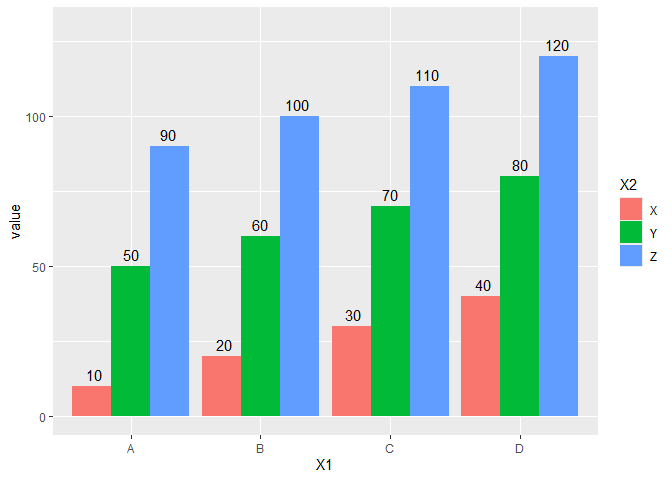
こんな感じに行く。
さらに正負の値が混じった次のようなデータを考える。
df <- data.frame(X = c("A", "B", "C", "D"),
                 value = c(10, 20, -10, -20))

ggplot(df, aes(x = X, y = value)) +
  geom_col()

このとき、正の値の場合は棒グラフの上に、負の値の場合は棒グラフの下に描画したいと思った場合を考える。単純にnudge_yなどで位置を書くと正負の場合分けができない。
ggplot(df, aes(x = X, y = value)) +
  geom_col() +
  geom_text(aes(label = value), nudge_y = 2)
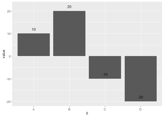
結論から言うとifelse()などで条件づけするとかける。
ggplot(df, aes(x = X, y = value)) +
  geom_col() +
  geom_text(aes(label = value), nudge_y = ifelse(df$value >= 0, 2, -2))

これで思ったグラフがかける。
Rのggplot2でデータにない値を凡例に反映させるメモ2
ggplot2パッケージの3.5.x以降で仕様変更があり、データ中に存在しない値を凡例に反映させるためには、以前の手法ではうまく行かなくなったので、現在動く手法のメモ。
例としてmtcarsデータの気筒数を因子型にしたものを用意して、グラフ化する。
library(ggplot2)
mtcars <- mtcars |>
  dplyr::mutate(cyl = factor(cyl, levels = 4:8))
ggplot(mtcars) +
  geom_point(aes(x = mpg, y = disp, color = cyl))
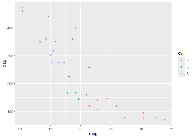
データ中に、5気筒、7気筒がないので凡例には反映されていない。でも、5気筒や7気筒の車も世の中にあるわけなので、データ中にないだけで凡例には凡例には合ったほうがいいなとおもうこともある。
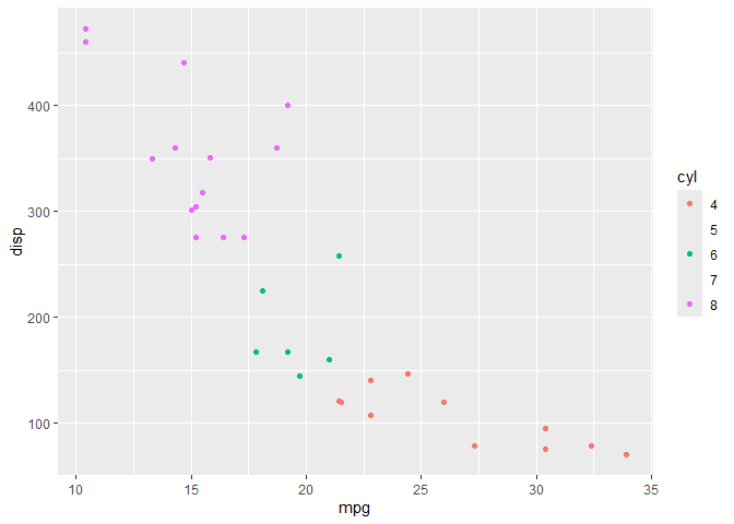
ドキュメントを一見すると、scale_color_*()やscale_fill_*()などの中でdrop = FALSEと指定することで存在しないデータを凡例に反映することができそうだが、これだけでは次の通り、凡例に数字は反映されているがポイントは反映されなくなってしまう。
ggplot(mtcars) +
  geom_point(aes(x = mpg, y = disp, color = cyl)) +
  scale_color_hue(drop = FALSE)
これを解決するには、追加でgeom_*()でshow.legend = TRUEとするといい。
ggplot(mtcars) +
  geom_point(aes(x = mpg, y = disp, color = cyl), show.legend = TRUE) +
  scale_color_hue(drop = FALSE)

ドキュメントを読むとちゃんと書いてるのだが、わかりにくく、ISSUEでも時折取り上げられている。
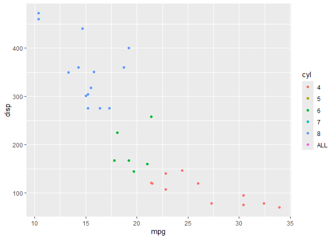
完全に存在しない値を加えたいならlimitsで細かく指定するといく。
ggplot(mtcars) +
  geom_point(aes(x = mpg, y = disp, color = cyl), show.legend = TRUE) +
  scale_color_hue(limits = c(4:8, "ALL"))
参考までに以前の手法は次の通り
lme4でOptimizerを明示した場合とそうでない場合とで計算結果が異なることがあるというメモ
Rで混合モデルを検討するため{lme4}のglmer()を使っていたら、Optimizerは何もしないと"Nelder_Mead"になっている(はず)なのだが、glmer()のcontrol引数を用いてglmerControl(optimizer = "Nelder_Mead")とすると結果が異なるというということに遭遇したため、メモをしておく。
細かいところまでの原因はわかっていないが、内部での処理の過程によるという程度まで。こういう事案がおこるという程度のメモ。
具体的な事例を示しておきたいが、わかりやすく数値が変わるような人造データができなかったので{lme4}の組み込みデータを用いる。簡単に解が収束するモデルやデータでは再現しないので、おそらくある程度の大きさと複雑さを持ったデータでないと再現しないと思われる。
library(lme4)
## Loading required package: Matrix
data(grouseticks)
# optimizerを明示しない場合
glmer(TICKS ~ YEAR+ HEIGHT + (1|BROOD) + (1|INDEX) + (1|LOCATION),
      family = poisson(),
      data = grouseticks) |>
  summary()
## Warning in checkConv(attr(opt, "derivs"), opt$par, ctrl = control$checkConv, : Model is nearly unidentifiable: very large eigenvalue
##  - Rescale variables?;Model is nearly unidentifiable: large eigenvalue ratio
##  - Rescale variables?

## Generalized linear mixed model fit by maximum likelihood (Laplace
##   Approximation) [glmerMod]
##  Family: poisson  ( log )
## Formula: TICKS ~ YEAR + HEIGHT + (1 | BROOD) + (1 | INDEX) + (1 | LOCATION)
##    Data: grouseticks
##
##       AIC       BIC    logLik -2*log(L)  df.resid
##    1794.5    1822.5    -890.3    1780.5       396
##
## Scaled residuals:
##     Min      1Q  Median      3Q     Max
## -1.6123 -0.5536 -0.1486  0.2850  2.4430
##
## Random effects:
##  Groups   Name        Variance Std.Dev.
##  INDEX    (Intercept) 0.2932   0.5415
##  BROOD    (Intercept) 0.5625   0.7500
##  LOCATION (Intercept) 0.2795   0.5287
## Number of obs: 403, groups:  INDEX, 403; BROOD, 118; LOCATION, 63
##
## Fixed effects:
##              Estimate Std. Error z value Pr(>|z|)
## (Intercept) 11.355790   1.598522   7.104 1.21e-12 ***
## YEAR96       1.180402   0.238120   4.957 7.15e-07 ***
## YEAR97      -0.978701   0.262772  -3.725 0.000196 ***
## HEIGHT      -0.023760   0.003437  -6.913 4.73e-12 ***
## ---
## Signif. codes:  0 '***' 0.001 '**' 0.01 '*' 0.05 '.' 0.1 ' ' 1
##
## Correlation of Fixed Effects:
##        (Intr) YEAR96 YEAR97
## YEAR96 -0.137
## YEAR97 -0.121  0.514
## HEIGHT -0.992  0.048  0.047
## optimizer (Nelder_Mead) convergence code: 0 (OK)
## Model is nearly unidentifiable: very large eigenvalue
##  - Rescale variables?
## Model is nearly unidentifiable: large eigenvalue ratio
##  - Rescale variables?
# control = glmerControl(optimizer = "Nelder_Mead")でoptimizerを明示する
glmer(TICKS ~ YEAR+ HEIGHT + (1|BROOD) + (1|INDEX) + (1|LOCATION),
      family = poisson(),
      data = grouseticks,
      control = glmerControl(optimizer = "Nelder_Mead")) |>
  summary()
## Warning in checkConv(attr(opt, "derivs"), opt$par, ctrl = control$checkConv, : Model failed to converge with max|grad| = 0.00341782 (tol = 0.002, component 1)
## Warning in checkConv(attr(opt, "derivs"), opt$par, ctrl = control$checkConv, : Model is nearly unidentifiable: very large eigenvalue
##  - Rescale variables?;Model is nearly unidentifiable: large eigenvalue ratio
##  - Rescale variables?

## Generalized linear mixed model fit by maximum likelihood (Laplace
##   Approximation) [glmerMod]
##  Family: poisson  ( log )
## Formula: TICKS ~ YEAR + HEIGHT + (1 | BROOD) + (1 | INDEX) + (1 | LOCATION)
##    Data: grouseticks
## Control: glmerControl(optimizer = "Nelder_Mead")
##
##       AIC       BIC    logLik -2*log(L)  df.resid
##    1794.5    1822.5    -890.3    1780.5       396
##
## Scaled residuals:
##     Min      1Q  Median      3Q     Max
## -1.6123 -0.5536 -0.1486  0.2850  2.4430
##
## Random effects:
##  Groups   Name        Variance Std.Dev.
##  INDEX    (Intercept) 0.2932   0.5415
##  BROOD    (Intercept) 0.5626   0.7500
##  LOCATION (Intercept) 0.2795   0.5287
## Number of obs: 403, groups:  INDEX, 403; BROOD, 118; LOCATION, 63
##
## Fixed effects:
##              Estimate Std. Error z value Pr(>|z|)
## (Intercept) 11.355721   1.598641   7.103 1.22e-12 ***
## YEAR96       1.180430   0.238124   4.957 7.15e-07 ***
## YEAR97      -0.978691   0.262776  -3.724 0.000196 ***
## HEIGHT      -0.023760   0.003437  -6.913 4.75e-12 ***
## ---
## Signif. codes:  0 '***' 0.001 '**' 0.01 '*' 0.05 '.' 0.1 ' ' 1
##
## Correlation of Fixed Effects:
##        (Intr) YEAR96 YEAR97
## YEAR96 -0.138
## YEAR97 -0.121  0.514
## HEIGHT -0.992  0.048  0.047
## optimizer (Nelder_Mead) convergence code: 0 (OK)
## Model failed to converge with max|grad| = 0.00341782 (tol = 0.002, component 1)
## Model is nearly unidentifiable: very large eigenvalue
##  - Rescale variables?
## Model is nearly unidentifiable: large eigenvalue ratio
##  - Rescale variables?
今回の場合ほとんどの数値は同じだが、いくつかの数値が微妙に異なる箇所がある。また、control = glmerControl(optimizer = "Nelder_Mead")と指定したほうでは収束していないというワーニングメッセージが出るようになっている。もっと大きく結果が異なることもデータ的にはある。
Rで都道府県名を処理するときのメモ
Rで都道府県のデータを触っていると、都道府県名に県がついているデータとついていないデータ(例:青森と青森県)があり、都道府県名をkeyとしてデータフレームを{dplyr}の*_join()系の関数で結合させるときに大変に不便なことがある。
ということでいずれかに統一する必要があるので、それ用の関数のメモ。いつもどこかにやってコピペするのでなくさないようにここに貼っておく。
県等がついていない都道府県名に県等をつける場合。{dplyr}と{stringr}パッケージを要する。
add_ken <- function(x) dplyr::case_when(x == "東京" ~ "東京都",
                                        x %in% c("京都", "大阪") ~ paste0(x, "府"),
                                        !stringr::str_detect(x, "県") & !(x %in% c("東京都", "京都府", "大阪府", "北海道", "全国")) ~ paste0(x, "県"),
                                        .default = x)
北海道は北海となることは基本的にはない(少なくとも行政が作ったデータを触っている範囲では)ので、それ以外で都府県がつくように処理する。行政データを触っていると全国が集計済みで存在することがあるのでそれもとりあえず取り扱えるようにしている。
add_ken(c("青森", "北海道", "京都", "東京"))
## [1] "青森県" "北海道" "京都府" "東京都"
add_ken("AKITA")
## [1] "AKITA県"
行政が作ったデータを触る範囲では上記の関数で十分。
逆に都道府県名から県等を取り除く場合は次の通り。
remove_ken <- function(x) dplyr::case_when(x == "東京都" ~ "東京",
                                           stringr::str_detect(x, "府") ~ stringr::str_remove(x, "府"),
                                           stringr::str_detect(x, "県") ~ stringr::str_remove(x, "県"),
                                           .default = x)
使ってみると次の通り。
remove_ken(c("東京都", "北海道", "秋田県", "沖縄県", "大阪府", "京都府"))
## [1] "東京" "北海道" "秋田" "沖縄" "大阪" "京都"
都道府県データを地域区分(東北や東海など)で集計しデータを処理したい時がある。今回の地域区分は総務省の地域課題2024の区分に従っている。
地域区分 : 地域課題分析レポート(2024年秋号) - 内閣府
chiikikubun_2024 <- function(x){dplyr::case_when(x %in% c("北海道") ~ "北海道",
                                                 x %in% c("青森県", "岩手県", "秋田県", "宮城県", "山形県", "福島県") ~ "東北",
                                                 x %in% c("茨城県", "栃木県", "群馬県") ~ "北関東",
                                                 x %in% c("埼玉県", "千葉県", "東京都", "神奈川県") ~ "南関東(東京圏)",
                                                 x %in% c("新潟県", "山梨県", "長野県") ~ "甲信越",
                                                 x %in% c("静岡県", "岐阜県", "愛知県", "三重県") ~ "東海",
                                                 x %in% c("富山県", "石川県", "福井県") ~ "北陸",
                                                 x %in% c("滋賀県", "京都府", "大阪府", "兵庫県", "奈良県", "和歌山県") ~ "近畿",
                                                 x %in% c("鳥取県", "島根県", "岡山県", "広島県", "山口県") ~ "中国",
                                                 x %in% c("徳島県", "香川県", "愛媛県", "高知県") ~ "四国",
                                                 x %in% c("福岡県", "佐賀県", "長崎県", "熊本県", "大分県", "宮崎県", "鹿児島県") ~ "九州",
                                                 x %in% c("沖縄県") ~ "沖縄"
)}
使ってみると次の通り。
chiikikubun_2024(c("東京都", "北海道", "秋田県", "沖縄県", "大阪府", "京都府", "全国"))
## [1] "南関東(東京圏)" "北海道"           "東北"             "沖縄"
## [5] "近畿"             "近畿"             NA
上記のコードでは都道府県名以外はNAで返ってくることになる(しそっちのほうが都合がいいこともある)が、.default引数を調整すると処理できる。
# 都道府県名以外はそのままの文字列を返す場合
chiikikubun_2024_ <- function(x){dplyr::case_when(x %in% c("北海道") ~ "北海道",
                                                 x %in% c("青森県", "岩手県", "秋田県", "宮城県", "山形県", "福島県") ~ "東北",
                                                 x %in% c("茨城県", "栃木県", "群馬県") ~ "北関東",
                                                 x %in% c("埼玉県", "千葉県", "東京都", "神奈川県") ~ "南関東(東京圏)",
                                                 x %in% c("新潟県", "山梨県", "長野県") ~ "甲信越",
                                                 x %in% c("静岡県", "岐阜県", "愛知県", "三重県") ~ "東海",
                                                 x %in% c("富山県", "石川県", "福井県") ~ "北陸",
                                                 x %in% c("滋賀県", "京都府", "大阪府", "兵庫県", "奈良県", "和歌山県") ~ "近畿",
                                                 x %in% c("鳥取県", "島根県", "岡山県", "広島県", "山口県") ~ "中国",
                                                 x %in% c("徳島県", "香川県", "愛媛県", "高知県") ~ "四国",
                                                 x %in% c("福岡県", "佐賀県", "長崎県", "熊本県", "大分県", "宮崎県", "鹿児島県") ~ "九州",
                                                 x %in% c("沖縄県") ~ "沖縄",
                                                 .default = x
)}
使ってみると次の通り。
chiikikubun_2024_(c("東京都", "北海道", "秋田県", "沖縄県", "大阪府", "京都府", "全国"))
## [1] "南関東(東京圏)" "北海道"           "東北"             "沖縄"
## [5] "近畿"             "近畿"             "全国"
他にもいろいろな地域区分があるが、上記のコードを書き換えると0から作るより比較的早くできる。
ちなみに、行政データの一部では都道府県名の先頭に都道府県コード2桁がくっついているものがある(北海道なら01北海道)。
これを取り除くには、
stringr::str_remove("01北海道", "[[:digit:]]+")
## [1] "北海道"
などとすればいい。
逆にくっつける場合は都道府県コードと都道府県名を突合する必要があるのでたとえば、github上にある{jaddress.jiscode}などを使って都道府県名から都道府県コードを取り出す作業をしてくっつけるといい。
# 都道府県コードを確認
jaddress.jiscode::jaddress_jiscode(c("北海道", "宮城県", "東京都", "鹿児島県"), "pref")
## [1] "01" "04" "13" "46"
# くっつける
paste0(jaddress.jiscode::jaddress_jiscode(c("北海道", "宮城県", "東京都", "鹿児島県"), "pref"), c("北海道", "宮城県", "東京都", "鹿児島県"))
## [1] "01北海道" "04宮城県" "13東京都" "46鹿児島県"
行政データを触るとまぁまぁ使う処理系のメモ。
RでNAが含まれるデータフレームをいい感じにハンドリングする自分用のメモ
RでNAが含まれるデータフレームをいい感じにハンドリングする自分用のメモ
EXCELのxls(x)ファイルをRで読み込むと謎の一行まるまる空欄のデータに遭遇することがある。例えば次のようなデータ。
d <- data.frame(都道府県 = c("北海道", NA, "青森県", "秋田県", "岩手県", "山形県", "宮城県", "福島県", NA, "新潟県"),
                value = c(1, NA, 2:7, NA, 8))
d
##    都道府県 value
## 1    北海道     1
## 2      <NA>    NA
## 3    青森県     2
## 4    秋田県     3
## 5    岩手県     4
## 6    山形県     5
## 7    宮城県     6
## 8    福島県     7
## 9      <NA>    NA
## 10   新潟県     8
これはEXCELの画面上でみたり、紙でみたときに見やすくするための措置だが、単純にデータハンドリングをするときには大変不便であり、取り除きたい。今回のようにNAの行以外はちゃんと値が埋まっているデータだとna.omit()で削除することができる。
na.omit(d)
##    都道府県 value
## 1    北海道     1
## 3    青森県     2
## 4    秋田県     3
## 5    岩手県     4
## 6    山形県     5
## 7    宮城県     6
## 8    福島県     7
## 10   新潟県     8
しかし、ここで次のようにデータところどころ歯抜けになっているデータの場合にはちょっと手間がかかる。たとえば次のようなデータの場合、単純にna.omit()を実行すると必要な行まで消えてしまう。
d <- data.frame(都道府県 = c("北海道", NA, "青森県", "秋田県", "岩手県", "山形県", "宮城県", "福島県", NA, "新潟県"),
                value1 = c(1, NA, 2:7, NA, 8),
                value2 = c(NA, NA, 1:6, NA, NA))
d
##    都道府県 value1 value2
## 1    北海道      1     NA
## 2      <NA>     NA     NA
## 3    青森県      2      1
## 4    秋田県      3      2
## 5    岩手県      4      3
## 6    山形県      5      4
## 7    宮城県      6      5
## 8    福島県      7      6
## 9      <NA>     NA     NA
## 10   新潟県      8     NA
na.omit(d)
##   都道府県 value1 value2
## 3   青森県      2      1
## 4   秋田県      3      2
## 5   岩手県      4      3
## 6   山形県      5      4
## 7   宮城県      6      5
## 8   福島県      7      6
ということでひと手間かかける。行の値すべてがNAである場合にFALSEになるように処理すればよい。行ごとに処理するのでapply()でMARGIN = 1で処理すると簡便にできる(あまり早くないけど)。
d[apply(d, 1, function(x) !all(is.na(x))),]
##    都道府県 value1 value2
## 1    北海道      1     NA
## 3    青森県      2      1
## 4    秋田県      3      2
## 5    岩手県      4      3
## 6    山形県      5      4
## 7    宮城県      6      5
## 8    福島県      7      6
## 10   新潟県      8     NA
これはNAに限らずたとえば「—」みないなので印刷した時にきれいに区切るための目印がある場合にも有効となる。
d <- data.frame(都道府県 = c("北海道", "---", "青森県", "秋田県", "岩手県", "山形県", "宮城県", "福島県", "---", "新潟県"),
                value1 = c(1, "---", 2:7, "---", 8),
                value2 = c(NA, "---", 1:6, "---", NA))
d
##    都道府県 value1 value2
## 1    北海道      1   <NA>
## 2       ---    ---    ---
## 3    青森県      2      1
## 4    秋田県      3      2
## 5    岩手県      4      3
## 6    山形県      5      4
## 7    宮城県      6      5
## 8    福島県      7      6
## 9       ---    ---    ---
## 10   新潟県      8   <NA>
d[apply(d, 1, function(x) !all(x == "---")),]
##    都道府県 value1 value2
## 1    北海道      1   <NA>
## 3    青森県      2      1
## 4    秋田県      3      2
## 5    岩手県      4      3
## 6    山形県      5      4
## 7    宮城県      6      5
## 8    福島県      7      6
## 10   新潟県      8   <NA>
また、データベースを読み込んで複数データを結合した時に本来は一つの列にまとまっていてほしかったのに、データごとに別の列に分かれてしまっているという場合がある。このとき、NAとなっている箇所を削除して、複数列にある一つの値だけを取り出したいという欲求にかられることがある。たとえば次のようなデータ。
d <- data.frame(都道府県 = c("北海道", "青森県", "秋田県", "岩手県", "山形県", "宮城県", "福島県", "新潟県"),
                value.1 = c(1, rep(NA, 7)),
                value.2 = c(NA, 2:7, NA),
                value.3 = c(rep(NA,7), 8))
d
##   都道府県 value.1 value.2 value.3
## 1   北海道       1      NA      NA
## 2   青森県      NA       2      NA
## 3   秋田県      NA       3      NA
## 4   岩手県      NA       4      NA
## 5   山形県      NA       5      NA
## 6   宮城県      NA       6      NA
## 7   福島県      NA       7      NA
## 8   新潟県      NA      NA       8
value.1~3にはそれぞれぞれ各行でいずれかの列に一つだけ値が入っている場合には、行ごとにna.omit()してその値を取り出して結合してやればいい。まずその前にちゃんとvalue.1~3のそれぞれの各行でいずれかの列に一つだけ値が入っているかを確認する必要がある。
# データフレームから"value"が含まれる列を取り出し、その各行でNAではない値が1だけである場合にTRUEを返すようにする
# 列の取り出しはいろいろな方法がありえる
# TRUEなので条件OK
all(apply(d[grep("value", colnames(d))], 1, function(x) sum(!is.na(x)) == 1))
## [1] TRUE
# 値をとりだす
apply(d[grep("value", colnames(d))], 1, na.omit)
## [1] 1 2 3 4 5 6 7 8
# 値を出たフレームに結合する
d <- data.frame(d,
                value = apply(d[grep("value", colnames(d))], 1, na.omit))
d
##   都道府県 value.1 value.2 value.3 value
## 1   北海道       1      NA      NA     1
## 2   青森県      NA       2      NA     2
## 3   秋田県      NA       3      NA     3
## 4   岩手県      NA       4      NA     4
## 5   山形県      NA       5      NA     5
## 6   宮城県      NA       6      NA     6
## 7   福島県      NA       7      NA     7
## 8   新潟県      NA      NA       8     8
また、紙で印刷したりEXCEL上で見やすいように空の列が挿入されている場合がある。たとえば次のようなデータ。
d <- data.frame(都道府県 = c("北海道", "青森県", "秋田県", "岩手県", "山形県", "宮城県", "福島県", "新潟県"),
                x1 = rep(NA, 8),
                value = 1:8)
d
##   都道府県 x1 value
## 1   北海道 NA     1
## 2   青森県 NA     2
## 3   秋田県 NA     3
## 4   岩手県 NA     4
## 5   山形県 NA     5
## 6   宮城県 NA     6
## 7   福島県 NA     7
## 8   新潟県 NA     8
このNAだけの列を削除したいが、na.omit()では削除できない。この場合はすべての列がNAの列を取り除けばいい。apply()でもいいが、叙述関数であるFilter()関数を用いればいい。{dplyr}のselect()関数でも同様にできる。
Filter(function(x) !all(is.na(x)), d)
##   都道府県 value
## 1   北海道     1
## 2   青森県     2
## 3   秋田県     3
## 4   岩手県     4
## 5   山形県     5
## 6   宮城県     6
## 7   福島県     7
## 8   新潟県     8
dplyr::select(d, function(x) !all(is.na(x)))
##   都道府県 value
## 1   北海道     1
## 2   青森県     2
## 3   秋田県     3
## 4   岩手県     4
## 5   山形県     5
## 6   宮城県     6
## 7   福島県     7
## 8   新潟県     8
ちなみに、これらは処理は行政がつくったデータでしばしば遭遇するので、github上に公開している{infun}パッケージに関数としていれている。
library(infun)
d <- data.frame(value01 = c(1:3, NA),
                value02 = c(1:2, NA, NA),
                value03 = rep(NA, 4),
                value04 = c(1:3, NA),
                value05 = rep(NA, 4))
d
##   value01 value02 value03 value04 value05
## 1       1       1      NA       1      NA
## 2       2       2      NA       2      NA
## 3       3      NA      NA       3      NA
## 4      NA      NA      NA      NA      NA
remove_na_cols(d)
##   value01 value02 value04
## 1       1       1       1
## 2       2       2       2
## 3       3      NA       3
## 4      NA      NA      NA
remove_na_rows(d)
##   value01 value02 value03 value04 value05
## 1       1       1      NA       1      NA
## 2       2       2      NA       2      NA
## 3       3      NA      NA       3      NA
d <- data.frame(id_1 = c(1:3, rep(NA, 6)),
                id_2 = c(rep(NA, 3), 4:6, rep(NA, 3)),
                id_3 = c(rep(NA, 6), 7:9))
d
##   id_1 id_2 id_3
## 1    1   NA   NA
## 2    2   NA   NA
## 3    3   NA   NA
## 4   NA    4   NA
## 5   NA    5   NA
## 6   NA    6   NA
## 7   NA   NA    7
## 8   NA   NA    8
## 9   NA   NA    9
consolidate_cols(d)
## [1] 1 2 3 4 5 6 7 8 9
check_onevalue_cols(d)
## [1] TRUE
Rでlm()関数で作成した回帰モデルをstep()関数でステップワイズしたときのAICの値がAIC()関数と異なる
FAQ:
Rでlm()関数で作成した回帰モデルをstep()関数でステップワイズしたときに表示されるAICの値がAIC()関数と異なるがなぜ?
雑なA:
AICを計算するときに、対数尤度ではなく残差平方和を用いて疑似的に計算しているから。step()関数やextractAIC()のドキュメントに書いてる。算出されるモデル間のAIC値の大小関係は対数尤度を用いたAICでも残差平方和で計算したAICでも同じなので、モデル選択場面では問題とならない。
少しちゃんと書く。
まず、実例を示す。まずは、lm()関数を用いて回帰分析のモデルを作成する。
# irisデータを用いて回帰モデルを作成する
res <- lm(Sepal.Length ~ ., data = iris)
# 中身を確認しておく
summary(res)
Call:
lm(formula = Sepal.Length ~ ., data = iris)

Residuals:
     Min       1Q   Median       3Q      Max
-0.79424 -0.21874  0.00899  0.20255  0.73103

Coefficients:
                  Estimate Std. Error t value Pr(>|t|)
(Intercept)        2.17127    0.27979   7.760 1.43e-12 ***
Sepal.Width        0.49589    0.08607   5.761 4.87e-08 ***
Petal.Length       0.82924    0.06853  12.101  < 2e-16 ***
Petal.Width       -0.31516    0.15120  -2.084  0.03889 *
Speciesversicolor -0.72356    0.24017  -3.013  0.00306 **
Speciesvirginica  -1.02350    0.33373  -3.067  0.00258 **
---
Signif. codes:  0 '***' 0.001 '**' 0.01 '*' 0.05 '.' 0.1 ' ' 1

Residual standard error: 0.3068 on 144 degrees of freedom
Multiple R-squared:  0.8673,    Adjusted R-squared:  0.8627
F-statistic: 188.3 on 5 and 144 DF,  p-value: < 2.2e-16
この、resを使ってみていく。
まず、step()関数を用いてステップワイズしてみる。
step(res)
Start:  AIC=-348.57
Sepal.Length ~ Sepal.Width + Petal.Length + Petal.Width + Species

               Df Sum of Sq    RSS     AIC
<none>                      13.556 -348.57
- Petal.Width   1    0.4090 13.966 -346.11
- Species       2    0.8889 14.445 -343.04
- Sepal.Width   1    3.1250 16.681 -319.45
- Petal.Length  1   13.7853 27.342 -245.33


Call:
lm(formula = Sepal.Length ~ Sepal.Width + Petal.Length + Petal.Width +
    Species, data = iris)

Coefficients:
      (Intercept)        Sepal.Width       Petal.Length        Petal.Width
           2.1713             0.4959             0.8292            -0.3152
Speciesversicolor   Speciesvirginica
          -0.7236            -1.0235
どの項目を取り除いてもAIC値が改善しないとのことで、取り除かれることはない。ここで、もともとのモデル(res)のAIC値は-348.57となっている。
resのAICをAIC()関数を用いて計算すると次のようになる。
AIC(res)
[1] 79.11602
step()で表示されるAICの-348.57とAIC()で計算できる79.1とだいぶ異なることになる。じゃあ、この-348.57はどこでみることができるかというとextractAIC()で見ることができる。
extractAIC(res)
[1] 6.0000 -348.5655
ところで、AICはAIC()関数のドキュメントやWikipediaを参照するとわかるが、 となることがわかる。これでAICを計算すると次のようになる。
# logLik()をつかって対数尤度を計算する
(res.likehood <- logLik(res))
'log Lik.' -32.55801 (df=7)
-2 * c(res.likehood) + 2 * attr(res.likehood, "df")
[1] 79.11602
これはAIC()関数で計算した結果と一致する。
ではextractAIC()の値はどこから来ているかというと、ドキュメントにもあるが、残差平方和を用いて計算している。
# RSS(残差平方和)を計算
(RSS <- sum(res$residuals ^ 2))
[1] 13.55649
# extractAICのドキュメントにならって計算
nobs(res) * log(RSS/nobs(res))  + 2 * (nobs(res) - res$df.residual)
[1] -348.5655
とextractAIC()関数(step()関数で表示されるAICとも)と同じ結果になる。
線形モデル(OLS回帰)の場合、誤差項が独立かつ同一の正規分布に従うと仮定すると、対数尤度は以下のように表すことができる。
ここで、
: 回帰係数ベクトル
[tex: σ2 ] : 誤差分散
: 目的変数のi番目の値
: 説明変数のi番目の値
: サンプルサイズ
最大対数尤度を求めるには、この式を と[tex: σ2 ] で偏微分し、0と等しいとおいて解く。
について偏微分すると、
これを解くと、最小二乗推定量が得られる。
ここで、
: 説明変数行列
: 目的変数ベクトル
これを解くと、誤差分散の推定量が得られる。
これらの結果を対数尤度の式に代入すると、最大対数尤度は以下のようになる。
したがって、 は、
ここで、 は定数であり、AIC
の計算においてはモデル間の比較に影響しないため、無視することができるため、対数尤度から計算されたAICでも残差平方和で求めた疑似的なAICでもモデル間の比較には影響しないため、無視することができる。
ということで、 は
で求めることができる。
resの例で確認してみる。
-2 * c(res.likehood)
[1] 65.11602
nobs(res) * log(2 * pi) + nobs(res) * log(RSS / nobs(res)) + nobs(res)
[1] 65.11602
ちゃんと同じ値が計算できることが確認できる。
このことから、extractAIC()で計算されるAIC値とAIC()で計算されるAIC値はどのくらいの差になるのかというと、結論から言うと となる。今回の例でいうと
AIC()で計算できるAIC値からextractAIC()で計算されるAICを計算すると次のようにようになる。
AIC(res) - nobs(res) * (1 + log(2 * pi)) - 2
[1] -348.5655
よって、AIC()で計算されるAIC値とextractAIC()で計算されるAIC値は、値そのものは近似していないが、差となる が定数なので、先にも述べたが、
ACI()で求めたAIC値を使っても、extractACI()で求めたAIC値をつかってもモデル間の比較には影響がないといえる。
なぜ直接AIC値を対数尤度を使って計算するのではなくstep()関数は残差平方和を用いて計算しているのかという点については、文章を見つけることはできなかったが、推察するに計算資源の限られた計算機的には対数尤度を計算するよりも残差平方和を計算していたほうが計算コストが少なくstep()が高速で回るからかなと思った。
現代の計算機の計算資源ならAIC()で計算しても計算コストはそれほど重たくないが今でもこの残差平方和を用いた方式なのは、かつての計算結果との一致性や、モデル選択上は特に問題にならないこと、ドキュメントに書いてるから解ってるだろということや、上記のように容易に差を検証できることなどがあるのかと思った。「あれ、step()のAIC値とAIC()のAIC値ちがうんじゃない?」と気付けるようならここまですぐに分かるだろう、というのもあるかもしれない(ただし優しくはない気がする)。
Rでmvnmleパッケージのmlst()をつかってLittleのMCAR検定を行う実装のメモ
以前に、LittleのMCAR検定を行う場合には{BaylorEdPsych}というパッケージに含まれるLittleMCAR()を使ってはいけないということを書いたが、これは内部で欠測値を含む行列の分散と平均の最尤推定を行う{mvnmle}パッケージのmlst()関数が既定値の計算回数では解が得られない可能性があるからというものだった。
別のパッケージ使ったらいいよ、と書いたが、そもそも{mvnmle}パッケージのmlst()関数の既定値での計算回数が少ないことが問題で、加えて言うとmlst()で解が収束しなかった場合にLittleのMCAR検定を行ったときに何らかのメッセージが出ればそれでOKな気がしてきたので実装してみた。というメモ。
やはり{mvnmle}パッケージのmlst()関数の対応変数数が多いのは魅力的。
{BaylorEdPsych}のLittleMCAR()や、{naniar}のna.test()を参考にした。
github上にあげている{infun}に入れている。
library(infun)
# 解が正しく得られた場合は特段のエラーなく解が出力される
LittleMCAR_test(airquality)
    Little's missing completely at random (MCAR) test

data:  airquality
X-squared = 35.125, df = 14, p-value = 0.001409
alternative hypothesis: the data is not Missing Completely at Random (MCAR)
# あえてiterlimの上限を変更し、解が正しく得られていない場合
# ワーニングメッセージが出力される
LittleMCAR_test(airquality, iterlim = 100, max_iterlim = 100)
Warning in LittleMCAR_test(airquality, iterlim = 100, max_iterlim = 100): The solution to maximum likelihood estimation of the multivariate normal distribution may not have converged.
 Adjust the values of arguments such as `iterlim` and so on.


    Little's missing completely at random (MCAR) test

data:  airquality
X-squared = 35.149, df = 14, p-value = 0.001397
alternative hypothesis: the data is not Missing Completely at Random (MCAR)
airqualityデータだとちょっと違いが分かりにくいので、{mvnmle}パッケージにあるmissvalsデータで見てみる。
LittleMCAR_test(mvnmle::missvals)
    Little's missing completely at random (MCAR) test

data:  mvnmle::missvals
X-squared = 11.161, df = 6, p-value = 0.08354
alternative hypothesis: the data is not Missing Completely at Random (MCAR)
LittleMCAR_test(mvnmle::missvals, iterlim = 100, max_iterlim = 100)
Warning in LittleMCAR_test(mvnmle::missvals, iterlim = 100, max_iterlim = 100): The solution to maximum likelihood estimation of the multivariate normal distribution may not have converged.
 Adjust the values of arguments such as `iterlim` and so on.


    Little's missing completely at random (MCAR) test

data:  mvnmle::missvals
X-squared = 14.592, df = 6, p-value = 0.02367
alternative hypothesis: the data is not Missing Completely at Random (MCAR)
こんな感じ。
見ての通りhtestクラス形式で返す。実態はリスト形式で標準でhtest形式で表示されない情報で、{BaylorEdPsych}のLittleMCAR()では表示されていた情報+αを答えとして持っている。
LittleMCAR_test(mvnmle::missvals) |>
  print.listof()
method :
[1] "Little's missing completely at random (MCAR) test"

alternative :
[1] "the data is not Missing Completely at Random (MCAR)"

statistic :
X-squared
 11.16069

parameter :
df
 6

data.name :
[1] "mvnmle::missvals"

p.value :
[1] 0.08353538

missing.patterns :
[1] 3

amount.missing :
                x1 x2        x3 x4         x5
Number Missing  NA NA 153.00000 NA 1240.00000
Percent Missing NA NA  11.76923 NA   95.38462

data :
$DataSet1
  x1 x2 x3 x4    x5
1  7 26  6 60  78.5
2  1 29 15 52  74.3
3 11 56  8 20 104.3
4 11 31  8 47  87.6
5  7 52  6 33  95.9
6 11 55  9 22 109.2

$DataSet2
  x1 x2 x3 x4    x5
7  3 71 17 NA 102.7
8  1 31 22 NA  72.5
9  2 54 18 NA  93.1

$DataSet3
   x1 x2 x3 x4    x5
10 NA NA  4 NA 115.9
11 NA NA 23 NA  83.8
12 NA NA  9 NA 113.3
13 NA NA  8 NA 109.4


stop.code :
[1] 1

iterations :
[1] 308
htest形式の何がいいのかというと、{broom}パッケージのtidy()関数などhtest形式に対応している関数があるといい塩梅に取り扱えるのがいいと思う。
LittleMCAR_test(mvnmle::missvals) |>
  broom::tidy()
# A tibble: 1 × 5
  statistic p.value parameter method                                 alternative
      <dbl>   <dbl>     <dbl> <chr>                                  <chr>
1      11.2  0.0835         6 Little's missing completely at random… the data i…
コードそのものは前述した二つとほとんど変わらず、一か所、{mvnmle}パッケージのmlst()関数を使っているところを、そもそもiterlimの上限値を増やし、それでも解が得られなかった場合はiterlimをmax_iterlimで設定した値まで増やして計算を繰り返すようにした(解が得られるまで無限にiterlimを増やしていく仕様にもできるが万が一解が無限に得られなかった場合無限ループに陥る可能性があるため、上限値を設けた)。
それだけ。